Looking for Consistency
Back in 2017 when I joined the Pomelo team, the app's design was not fully documented. Most editable files were Illustrator files and a few pages were just directly built by Front End developers without design guidance.
As soon as my questions about CTAs usage got repetitive, I started a UI Inventory, along with the design of some screens and user journeys on Sketch. But soon I got immersed in daily business activities and I was only designing specific screens that were needed for a feature update. I couldn’t focus on the design structure definition anymore.
When a new designer joined the team, she started asking questions about design consistency. Even if it was exciting, I felt embarrassed about my answers the truth was we didn't have a library of visual components and patterns.
We also didn't have the experience defining guidelines of established software, but still, we had theoretical knowledge about Design Systems and we were aware of the fact that we were wasting time on repetitive UI tasks. With each upcoming project, using Sketch and Zeplin, we cleaned the screen's design by reducing visual patterns; we were working hard and soon the workflow became faster.
Role: UI Design Team Lead
Platforms: Mobile Apps & Web
Disciplines: User Interface Design
Tools: Sketch, Zeplin, InVision app
New Store, New Alphabet
It was 2019 and Pomelo was thriving, a new Hong Kong store was opening and all the teams were getting ready, including the creative ops team who came to ask,
"How long would it take you to add a Chinese Font to the apps?"
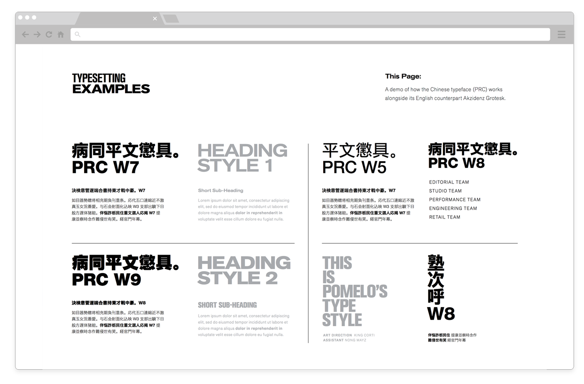
We were shocked... But we understood the opportunity design deities were opening for us, so we prepared a presentation to share the number of font styles we had in the system, and how it was compulsory to synthesize and simplify our typographic system (or type scales) to be able to introduce a new alphabet. We successfully pitched the project to the management team and the main objective was set: to synthesize the number of fonts in our apps, by creating a reusable list of styles that could be easily translated into different languages.
Even though designing everything from scratch would have been easier, we needed to deliver within the new store opening timeline. We needed to adapt a living software to the new requirements in only two months.

Art Directors were going through their own big challenges. The idea of purchasing a custom-made font that included the Roman alphabet, Thai alphabet, and Chinese characters, was out of budget. And they were forced to find three different fonts that were close enough to their concept.
When their team shared the typographic usage guidelines, (image below) it was far from the kind of document we were expecting to be able to update the typographic system, but we understood we needed to build a bridge, a visual communication dynamic where all the creative teams were able to set a common ground.
When solutions create new problems, It's called evolution
We started by reducing the initial list of fonts that were used on the website homepage and the Apps feed. To be able to compare how the system would look in three different alphabets.
The idea was a success and soon we started working together in a more fluid way, but the creative teams manifested how they were not going to be able to create a master Typographic Style Guide if they were not able to see all screens comparisons. We originated this situation, and we didn’t have the time to follow their suggested process. So we proposed we were going to define the initial list and we were going to map all the systems to finally get it approved by Art Directors. Every solution was opening a new upcoming problem for us.
Thinking about the list of pages we needed to include we noticed how some pages and user journeys were more important than others, following two criteria:
- The time when the user reaches that page.
- How the complexity of the page itself was going to give us guidance when creating simple pages.
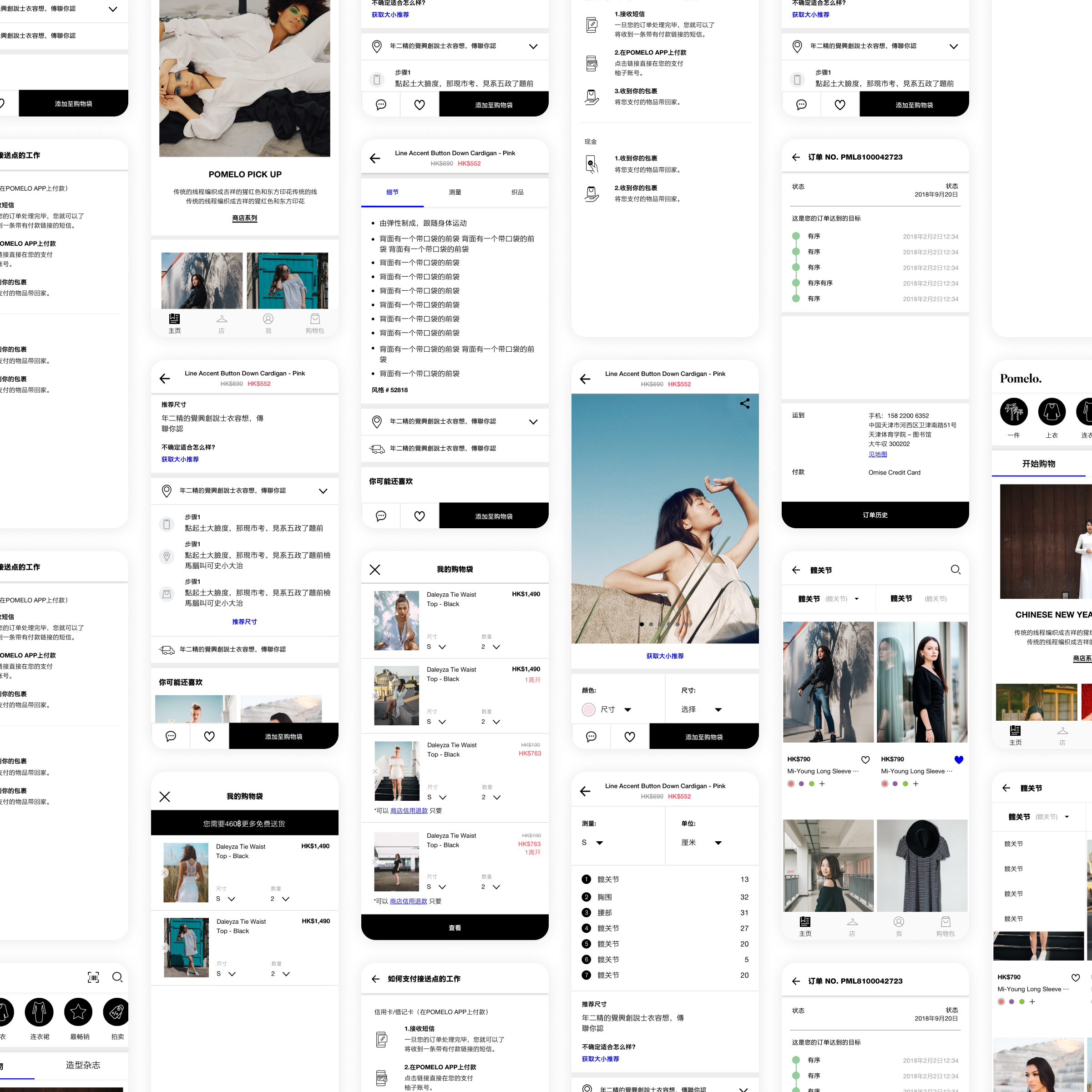
Using our own Web and Apps sitemaps and our user journey happy paths, we had the means to divide our “to-do list” into primary and secondary pages. With a more cohesive plan, we were able to see how the project was measured in complexity and time.
The task seemed monumental.
But we did it. We went through every single page adapting the design to only the list of font styles we had previously defined. The steps of the process were considered as journeys or pages, and that also included all the possible use cases.
We were following our own progress with an old-school technique, a whiteboard and erase markers, the fact that it was a dirty board where everyone was striking through and even other colleagues were leaving notes was somehow encouraging.
Owning both roles as a designer and the leader of the project, I was responsible for creating, planning, structuring, and executing the Pomelo typographic style guides project as the UXUI team design support to a business necessity to be able to open a new store that required a new language and alphabet.
What we learned
- We learned how to be able to work as a bridge between front-end development teams and art directors. Their professional expectations were not supposed to be competing with each other but addressed using the appropriate visual tools and language.
- This was our entryway into creating a design language for Pomelo digital products and every problem opened multiple questions making us feel how small, yet important was our first step.
- The typographic style guides were our foundation block for the UI Kit that came during the Pomelo Brand Redesign. Read the next post here